What is Responsive Web Design?
Responsive Web design is the approach that suggests that design and development should respond to the user’s behavior and environment based on screen size, platform and orientation.
What is a responsive website?
Responsive website is a website that should have the technology to automatically respond to the user’s preferences. This would eliminate the need for a different design and development phase for each new gadget on the market.
What is a mobile responsive website?
Mobile responsive website is a website where when the user switches from their laptop to mobile phone, the website should automatically switch to accommodate for resolution, image size and scripting abilities.
Responsive vs Adaptive Web Design
Responsive web design is a fluid approach whereby a page rearranges itself based on the detected screen size. Adaptive web design is a type of web design whereby the browser loads a layout created specifically for the given platform.
Elements of RWD:
Responsive Website:
https://arkadikorotots22.thkit.ee/responsive/
Adaptive Website:
https://arkadikorotots22.thkit.ee/adaptive/
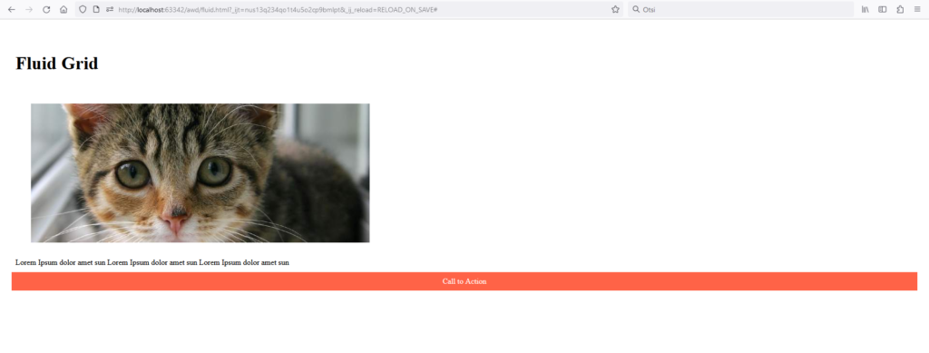
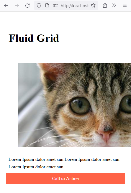
Fluid Grid
A fluid grid breaks down the width of a page into smaller and equally sized columns where it places the content. A fluid grid layout provides a way to create different layouts that match with different screen sizes to properly display the website.
When not resized:
When resized:
CSS Code:
.card-container {
display: grid;
padding: 1rem;
grid-template-columns: repeat(auto-fit, minmax(320px, 1fr));
grid-gap: 1rem;
}
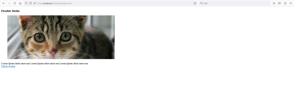
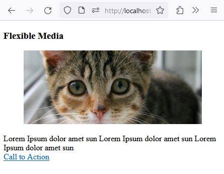
Flexible Media
In responsive web design, flexible images are also called adaptive images. They provide image solutions with no fixed display size restrictions. This helps to resize images neatly and nicely.
Website:
https://arkadikorotots22.thkit.ee/awd/flex.html
When not resized:
When resized:
CSS Code:
img {
max-width: 100%;
height: auto;
}
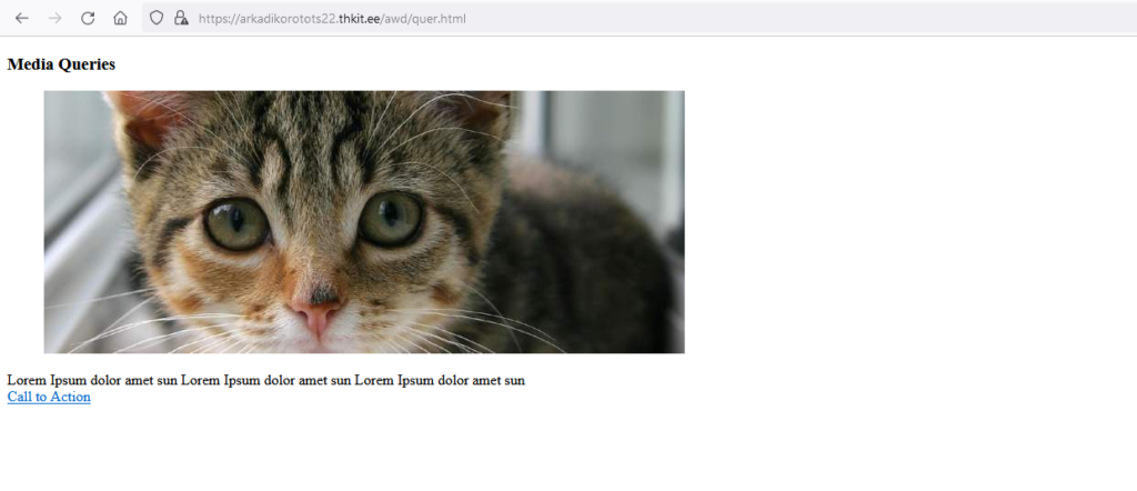
Media Queries
Media query is a feature of CSS3 that allows the content of a webpage to adapt to the type of media that the page is rendered in.
Website:
https://arkadikorotots22.thkit.ee/awd/quer.html
When not resized:
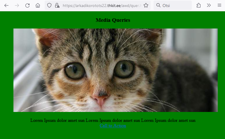
When resized and less than 800px:
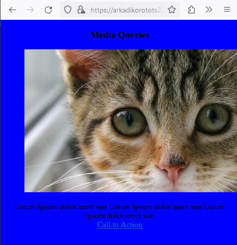
When resized and less than 500px:
CSS Code:
@media screen and (max-width:800px) {
body {
text-align: center;
background-color: green;
}
}
@media screen and (max-width:500px) {
body {
text-align: center;
background-color: blue;
}
}
Conclusion:
Responsive units are the magic behind web layouts that fluidly adapt to diverse devices. By harnessing relative units like em, rem, and viewport units, web developers can ensure their designs look stellar on smartphones, tablets, laptops, and everything in between. Remember, pixel units still have their use, especially for fixed-size elements.
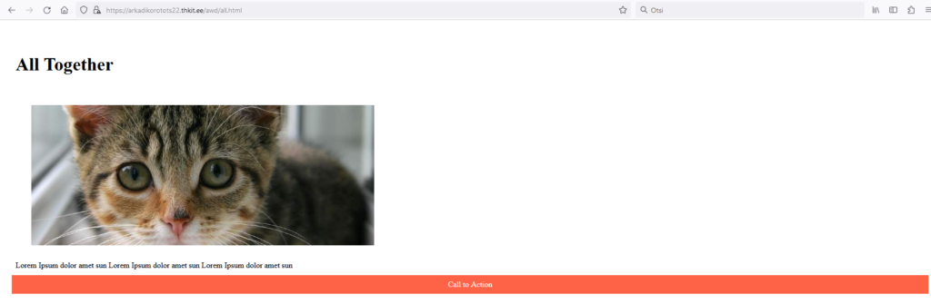
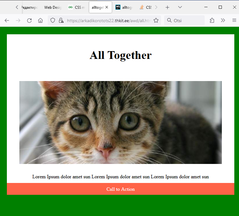
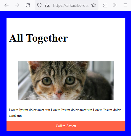
All Together:
Website
https://arkadikorotots22.thkit.ee/awd/all.html
When not resized:
When resized and less than 800px:
When resized and less than 500px:
CSS Code:
img {
max-width: 100%;
height: auto;
}
.card__title {
font-size: 2rem;
padding: .5rem;
}
.card__description {
padding: .5rem;
line-height: 1.6em;
}
.button {
display: block;
background-color: tomato;
padding: 10px 20px;
color: white;
text-decoration: none;
text-align: center;
transition: .3s ease-out;
}
.card-container {
display: grid;
padding: 1rem;
grid-template-columns: repeat(auto-fit, minmax(320px, 1fr));
grid-gap: 1rem;
}
@media screen and (max-width:800px) {
body {
text-align: center;
background-color: green;
}
}
@media screen and (max-width:500px) {
body {
text-align: Left;
background-color: blue;
font-size: 75%;
}
}
